Sunday, February 23, 2020

Week Five: Outside of Class

After class on Wednesday, I created another storyboard for my logo indent project.

The third one is similar to the first one I created, but the logo will appear in the correct direction over the frame progression and then possibly revert back to the original design at the end. 


I am thinking of going in the direction of the first storyboard with the text appearing in the correct direction and then transitioning into their logo. The "typing out" style (second storyboard) I think may lead to a longer duration of time (closer to 5 seconds) which I am trying to keep it short. Also, the correcting of the duration of characters (third storyboard) isn't building up to their logo it is more of taking it apart so I don't think I will use that one. 

_________________________________________________________________________

Saturday night I began working on my vectorized storyboard. My first challenge is to determine the font used in their design. On the website Font Squirrel, you can upload an image under the application "Font Identifier" and it will decipher what font is being used. 

The website determined the typeface used is or is similar to SansSerifFLF which I was able to download for free on the website FontZillion.


SansSerifFLF is a larger family with many variations so my next task was to determine which to use. I believe the closest is SansSerifBldFLF Medium. 


I started vectorizing my storyboard by creating the outline in Illustrator for the 7 frames. 


_________________________________________________________________________________

Sunday morning I continued to work on my storyboard. I believed I had found the correct font, but when I went to the type of "Seek Discomfort" everything looked close to correct except the M. The M in the logo doesn't have sharp points in the peeks of the strokes they flatten out. I went back to Font Identifier and tried again and I found a typeface called Cocogoose that looks more similar to the original typeface. 

Top -  SansSerifBldFLF Medium
Bottom - Cocogoose
With my typeface chosen and layout made I began vectorizing my original pencil sketched out storyboard. 


Wednesday, February 19, 2020

Week Five: B


After sharing my logo options to the class I decided to choose the "seek discomfort" secondary identity from Yes Theory. Even though this is not their main logo for their channel, this design still appears on their home screen, on their apparel, which is the main mantra of their videos. 

I believe this design can still work in any of their videos, but rather than being at the beginning, the design can appear at the end of the videos as a transition between the end of the video and their "please subscribe" still frame with links to other videos. 

I knew that Yes Theory has apparel for their channel, but upon further research, I found that their shop is called "seek discomfort" so this animation could also be used there as well. 


The next step was working on my storyboard options for the animation. The time frame is 3 to 5 seconds which is not much time to create movement and still has a pause for readability. I decide to aim for a 3 to a 4-second window for my motions so the design does not linger too long.

I found two simple videos that are 3 and 4 seconds long to get a sense of the time I will have and create a mental layout of the visual motions. 


I created two storyboard layouts during class time. 

The first is a transition of the text being the correct direction to the mirrored/edited logo they have. The changes would be quick ending at 3 seconds but I may add a slight 1/2 second to a second pause at the end for emphasis. 


The second storyboard I completed is a little longer with the logo being broken up into its characters and appearing letter by letter in each frame. 


Monday, February 17, 2020

Week Five: A

We began class by critiquing our Message in Motion exercises with the class and then small groups.

I shared mine in a small group of four people. Overall they all agreed that the project was effective. It was easy to read and the transitions were smooth and consistent (I even got a small laugh when they saw the big typing bubbles). I was concerned at first that the speed was fast for the number of words being shown, but they said that there was enough time and because they stayed faded on screen they were still readable. 

We were then introduced to our first official project: a logo indent for either an opener or an end tag. 

I began looking for Youtube channels that have fairly consistent layouts for their videos that have a logo or brand identity, but it is not animated. All three options bellow logo's are wordmarks and would be used as openers for their channel's videos. 

1. The Art Assignment - a weekly PBS Digital Studios production hosted by curator Sarah Urist Green on Youtube. The channel explores art and art history through the lens of things happening today.


The Art Assignment has two versions of their logo both used on their channels homepage. Our professor showed us an example of a 60s television broadcasting company (I believe was called the United Artist Network) animation where the main logo that showed the entire name of the brand transitioned into the secondary logo. I think it could be interesting to create something similar with the two As maybe having "Art Assignment" written out and having the second A flip over to make the secondary logo. 


Here is the video the animation could be added to at the beginning.


2. Yes Theory - a Youtube channel about three friends who travel and meet people functioning on the belief that "life can be as authentic and fulfilling as you wish if you seek discomfort".


Yes Theory also has two versions of their logo both used on their channels homepage. Their main logo is the "Yes Theory" wordmark shown to the left and the "Seek Discomfort" is their secondary logo. Their channel is about their personal explorations and they strive to inspire their viewers to seek discomfort and try new things. Their main identity has a very personal touch to it and I think could be interesting to animation to appear handwritten as the typeface style is.


Here is the video the animation could be added to. At 8 seconds there is a brief pause where the screen goes black and then transitions into their video.


3. AsapSCIENCE - a Youtube channel that explains scientific events or phenomenons through whiteboard animations.


I believe that the logo to the left is AsapSCIENCE's primary logo for their Youtube channel, but when I researched their website the circle one to the right was used. If I were to choose this option I would use the logo to the left since the animation would be used for their Youtube channel. I am straying away from this option a little more than the others primarily because their logo is bust already and making the parts be animated will make the readability even more challenging. I understand the aesthetic they are alluding to because their channel does use hand-drawn whiteboard animation, but I am not sure what direction I would go. 


Here is the video the animation could be added to at the beginning.


Wednesday, February 12, 2020

Week Four: Outside of Class

Monday evening I completed the storyboard for the "Message in Motion" project.


Some things may need to be adjusted like the time and leading, but overall I feel confident in my general layout.

__________________________________________________________________

Wednesday night I continued working on my Message in Motion Animation. Sadly when I opened the document on my personal computer I realized I do not have Helvetica and I could not download it for free anywhere so I had to change the type to Arial. I chose to keep the typeface a simple sans serif because I want the composition to resemble typing and the "texting aesthetic". These messages were simple words back and forth between phones but they lead to how my life is now so I wanted to continue the simplicity of a text. 

My next step was to work on the "Yes I do." section so it appears as if it is being typed out. I struggled at first because the curser has a much lower baseline than the characters so it kept wanting to adjust to being the same as I typed. My solution was I made multiple layers of the phrase when a letter was not to be visible yet I would make that character white so it was unseen. 


After replaying what I had completed so far a few times I realized that the opacity of my text was not transitioning correctly. The type was fading after it had moved not in between the adjustments. I realized it was because I had not set the percentages of the transitions correctly so I adjusted the duration of the fade so they transition as they move.

At the end of the night, this is what I had completed so far. 


_____________________________________________________________________________ 

Thursday night I continued working on my animation. I continued repeating the pattern of text appearing then fading keeping the same percentages for the transitions adjusting the duration based on how much there is to be read. 


I adjusted one of the opacity transitions to change after the typing bar disappears so it reads as a sent message.

My next step was to work on the "typing dots" (periods). They are first going to appear in their more traditional speed and position and then get larger to emphasize the stress of the conversation. 

The approach is similar to the blinking cursor (which is just a narrowed lowercase L) layering the layers behind one another at different positions of the frame.


_________________________________________________________________________ 

Friday afternoon I went to lab and finished up my animation. I was close to completed, but I decided to make a small adjustment to the typing dots. To make them appear more authentic I kept a 25% opacity dot for the entire duration of the movement so the file din black dot appeared to be moving across the screen.


Below is my final video uploaded to Youtube.


Week Four: B

To start class I volunteered to share my storyboard for my "Message in Motion" to the class. I received some helpful feedback with my design. Overall I needed to try and build on my idea. Because it is a text conversation I wanted to stay with that similar vertical building format, but I need to try to exaggerate an aspect of the composition. My classmates suggested amplifying the typing dots since those already build tension and based on the stressfulness of the conversation those can be amplified. 

I decided to edit the ending of the animation increasing the size and duration of the typing dots from frame 14 to the end which can be seen below.


After my edits, I began working in After Effects. 

I started by trying to set a speed for the transition for the text moving up. I used guides to keep the spacing consistent. 


After determining the duration of the transition I continued adding the lines of text and moving them upwards. Towards the end of class, this is what I had completed so far.


Another concern that was addressed in my sharing of my storyboard to the class was the consistent verticle format and the large amount of text on the screen. Taking a step back there is a lot of text on the screen at a time. So I began thinking of the one example our professor showed us where the person used a decrease in opacity to fade one word when another word came on screen. I began to explore using a change in opacity to create emphasis on the messages at the bottom. 


I have the opacity at 100% then 25% then 8% and when they reach the very top then 0%. Right now I have the first two messages fading together but I may adjust that if that disrupts with the consistency. 

Monday, February 10, 2020

Week Four: A

After critiquing our shape and rhythm projects we began to start thinking about our next project: "Message in Motion". For this assignment we are to use foreshadowing and recall to create a visual voice for a short phrase, saying, or conversation.

I began brainstorming by thinking of either a conversation, quotes, poems, or song lyrics that are meaningful to me and I can also animate in an interesting way. 


The following are some ideas I have for each direction I could go:


 Quote 


I have a little box on my desk of small square cutouts that have inspirational quotes on them. I sometimes flip through them for motivation and then display them on my desk. Two of my favorite quotes I found from that box are 

"Every accomplishment begins with a decision to try." by Edward T. Kelly 

"Keep focused on who and what is important in your life. Making a life is more important than making a living." by Larree Renda


 Poem 


I grew up reading Shel Silverstein's poems and looking at them now they are Wonderfull examples of interacting typography and illustrations together. As I was searching through different poems I found one titled "Lazy Jane" that I think would be interesting to use. The structure is stacked, but also there is a lot of repetition in the words that can be used for recall. 

 Song Lyrics  

I looked up the lyrics to some songs I enjoy to see if I can find parts that would be interesting to explore.

  •  "She Will Be Loved" - Maroon 5
    • I don't mind spendin' everyday 
      Out on your corner in the pourin' rain
      Look for the girl with the broken smile
      Ask her if she wants to stay awhile
      And she will be loved, and she will be loved

  • "Beautiful Dream - Bazzi
    • I had a dream about you last night
      Your eyes were shining so bright
      Those lips and that bittersweet smile
      I need this forever
      Beautiful dream, yeah, yeah
      Don't know what it means, yeah, yeah
      All I know is I don't know
      But I need this forever


 Conversation  


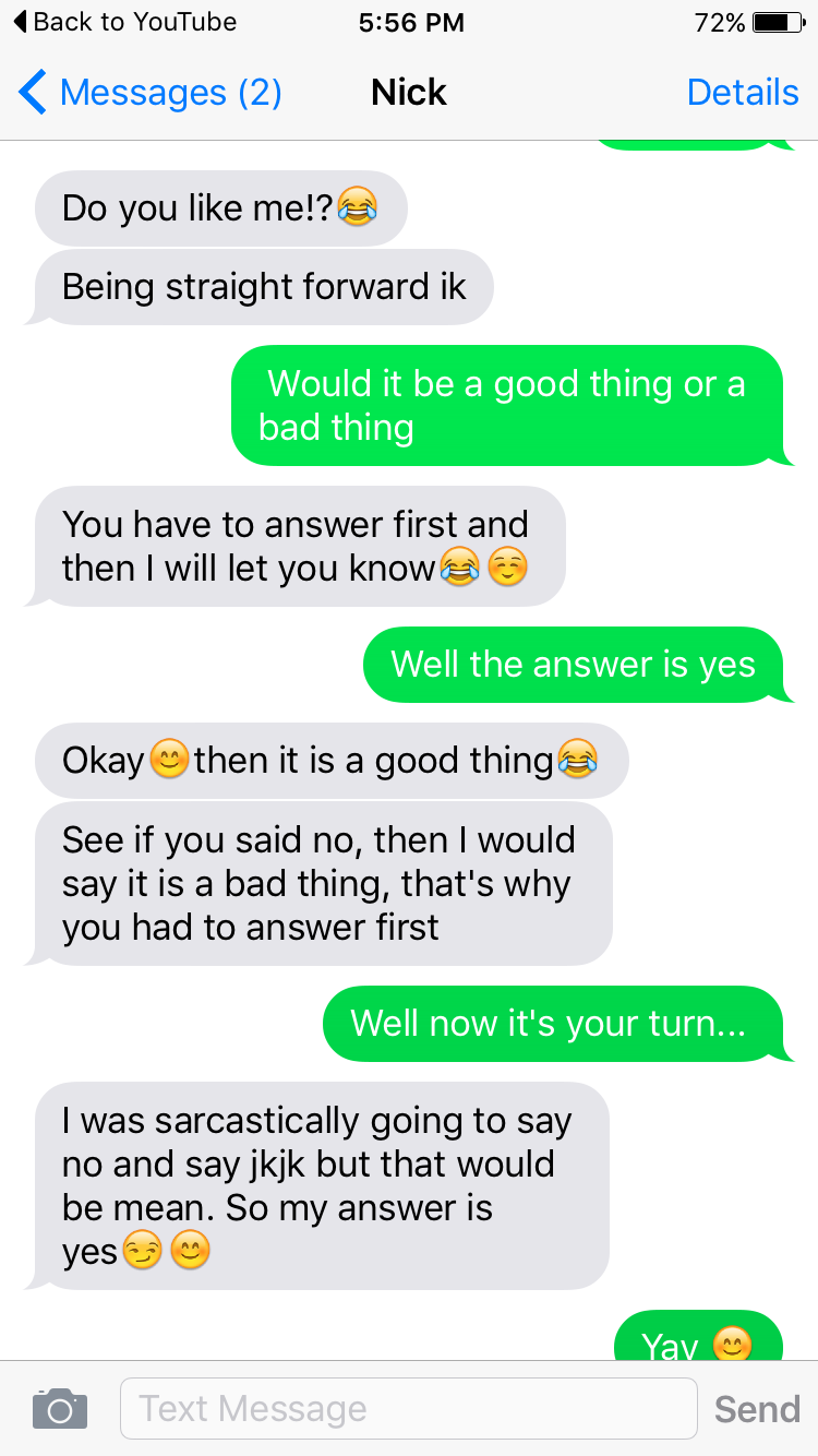
The idea I am leaning the most towards is to use a text conversation I have had and have the words/sentences stack on one another focused on either the right or left side to show the different sides of the conversation. I have a screenshot of a text my now boyfriend sent me almost four years ago asking me if I liked him. There are a lot of emojis I would exclude and I would simplify some of the messages to make them more concise, but I think it would convey foreshadowing well and would have a storyline too.

_________________________________________________________________________

After speaking to my professor, I decided to go in the direction of the text conversation. It's a little long, but I can exclude some of the extra wording and messages. 

I started by first picking a typeface to use for my animation. I am going to use the type that Apple uses for its messaging which is Helvetica (which is the same typeface that is used on my blog). 

I then printed out templates for my storyboard. 

Thursday, February 6, 2020

Week Three: Out of Class

On Thursday evening I encoded my shape rhythm animation and uploaded it to Youtube.


I began thinking about how I wanted to design the next project on using the word "rhythm" to show a rhythm. Our professor suggested that we think of a song or rhythm and try to base our animation using that song. I have been listening to the artist Lizzo a lot recently so I chose the song "Cuz I Love You" from her Album Cuz I Love You. This song has a very interesting beginning with a vocal progression to a direct very intense beat that follows through the rest of the song. 


With keeping the wave-like intro in mind I started trying to create a wave with the type similar to the flow of her voice. 


With the movement starting and stopping on the baseline I felt that there wasn't enough flow so I worked on having the type move up off the baseline then down below to emphasize the wave motion. 


I wasn't sure how to layer in the beat at first. Of the examples, we looked at in class I enjoyed the one with the letters separated and appearing scattered to a beat on the screen.


I removed the original word used for the wave because I felt it was distracting being half visible and half covered. Unlike the example, rather than varying the placement of the individual letter I altered the duration of the overall layer. By the end of the night, I had this completed so far. 


_________________________________________________________________________________

On Friday evening I continued to work on my rhythm project. After some reflection and rewatching the video I felt that changing the duration of the overall layer wasn't coveying the rhythm as much as I was hoping. So I decided to break the letters apart and focus on creating a repeating pattern.

After listening to the song closely I had this pattern created:


I then finalized the copied the pattern I created to repeat 3 times for an overall duration of 15 seconds and posted it to YouTube.